Introducing 22oz Copper Insulated Water Bottles! Cold for 48 hours & Hot for 12. In the SHOP Now

From Traditional to Digital: The Birth of the Botanic Series
From hand drawn collages in a dollar store frames to a digital art series in four colorways, this is the story of how three flowers became the Botanic Series at Line & Blossom Design.
 ByLeona

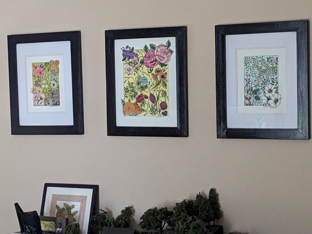
For years if you visited my home you would have seen three framed collages hanging above my sofa. They were drawn by hand, pen on paper, flowers and leaves spilling into each other in that particular way that happens when you draw without a plan. I loved them. When I decided to launch Line & Blossom Design, I couldn’t leave them behind. Those three pieces became the inspiration for the Botanic Series. I was able to go from traditional to digital art.
Switching to digital drawing created an immediate problem. Everything I had drawn up to that point was done traditionally. As I looked at each of those finished collages above the sofa, I wanted them included in my soon to be open shop.
At 11×14 and a scanner that did 8.5×11, the math didn’t work. I decided to instead use them as inspiration for new botanical collages that would be drawn digitally. I also thought it would be a great way to get used to drawing with a stylus in place of a pen.
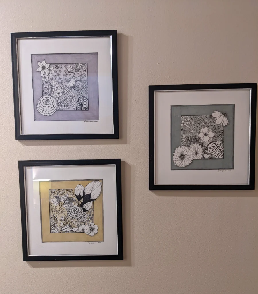
Before we get into the inspiration for the Botanic Series I think you should know where my collages began life. The first botanical collage I ever drew was done in late 2021. I just started drawing one day and kept adding flowers, leaves, and vines. It wasn’t preplanned, I just drew whatever felt like it should be in that spot or near those flowers.
Where My Collages Began Life
The First Collage
The finished piece fit into a 9×9 dollar store frame I had, and over the course of a couple of months 2 more were added. These original botanical collages hang in my home to this day, with upgraded frames now.
I started by creating a “frame” to keep my collage focused, but as I am one that doesn’t like being confined my art simply had to break out of that frame in a few places at least. I loved the movement and perspective it gave that simple frame line.
Adding Color
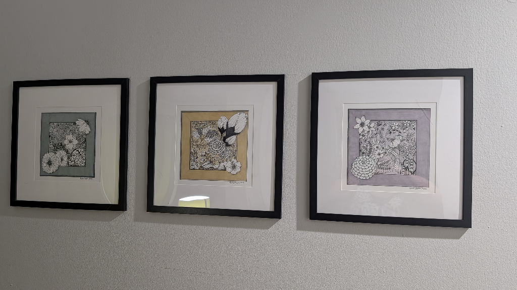
When the drawing was complete I wanted color, so I decided to use my new alcohol markers. I chose very light muted shades for each one: grey-green, soft lavender, light buttery yellow. The beauty of alcohol marker is the more layers the deeper the color. I took advantage of this and did only one layer in the main background and multiple in the outer frame area. This provided a nice depth to the pieces.
For me, drawing collages was an adventure in discovery. Keep in mind that when I was drawing these I didn’t have a clue I had aphantasia (no mind’s eye) or even knew it was a thing. The adventure of following an unknown path was exhilarating.
I didn’t have to fret over figuring out a single scene or flower to focus on. I didn’t have to try to “picture” the finished piece in my mind like most drawing tutorials tell you to do. There was no need for drawing a thumbnail of what I envisioned first. Which by the way made no sense to me considering I couldn’t “see” the piece before I drew it.
The Sky, Grass, and Sun Collages
I eventually decided I wanted to draw bigger collages and the Sun, Sky, and Grass collages were born. The names actually refer to the background colors I chose to unite the set: green grass, blue sky, and yellow sun. Only one person in my family understood this concept without me explaining it. I found this odd because it seemed so obvious to me.
The Sky Collage
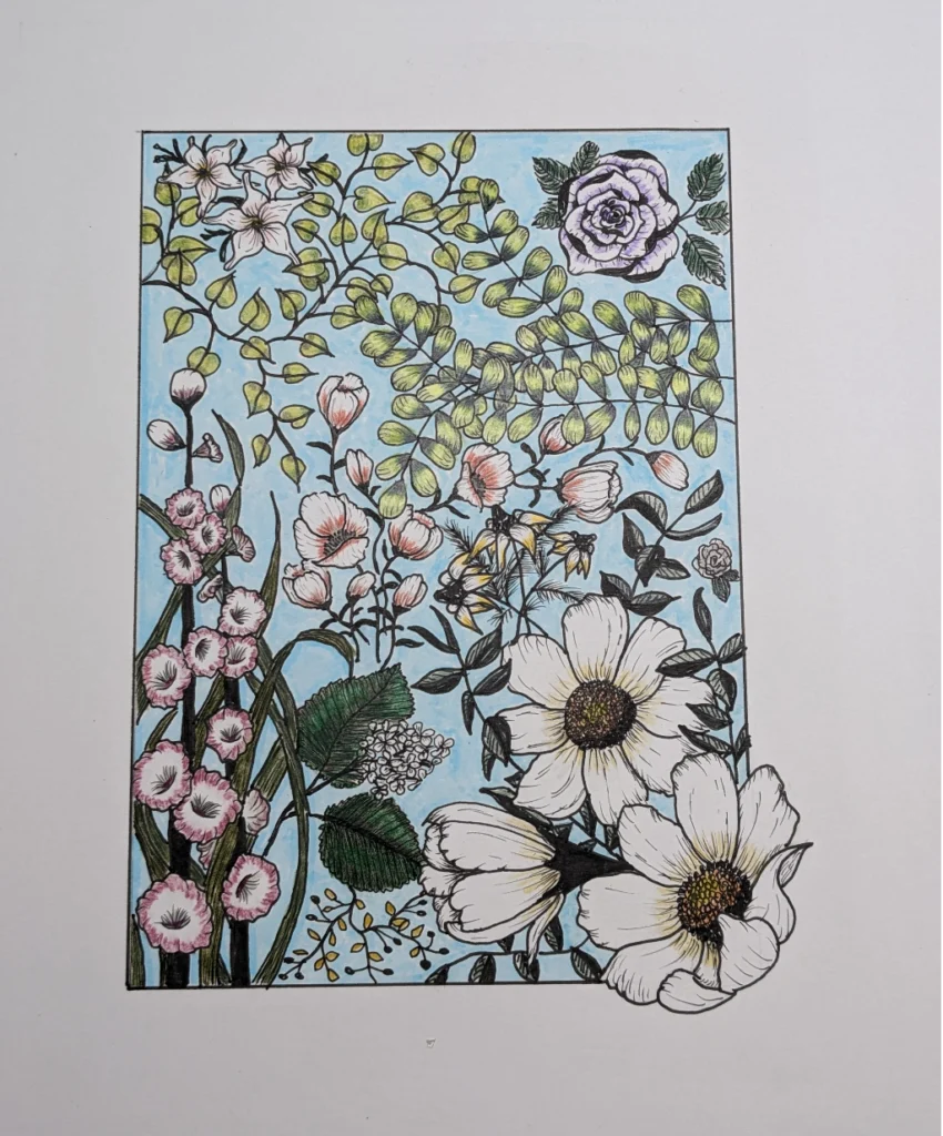
The first piece I chose to focus on was the sky. The main flower, well the largest one, was a cosmos grouping in the bottom left. I drew all the line art, then added the sky blue background. Looking at what I thought was the finished piece, I felt it needed some color.
At this time I was also experimenting with colored pencils, so I pulled them out and started adding just hints of color on each element. I loved the end result and was excited to start the next piece, the grass.
The Grass Collage
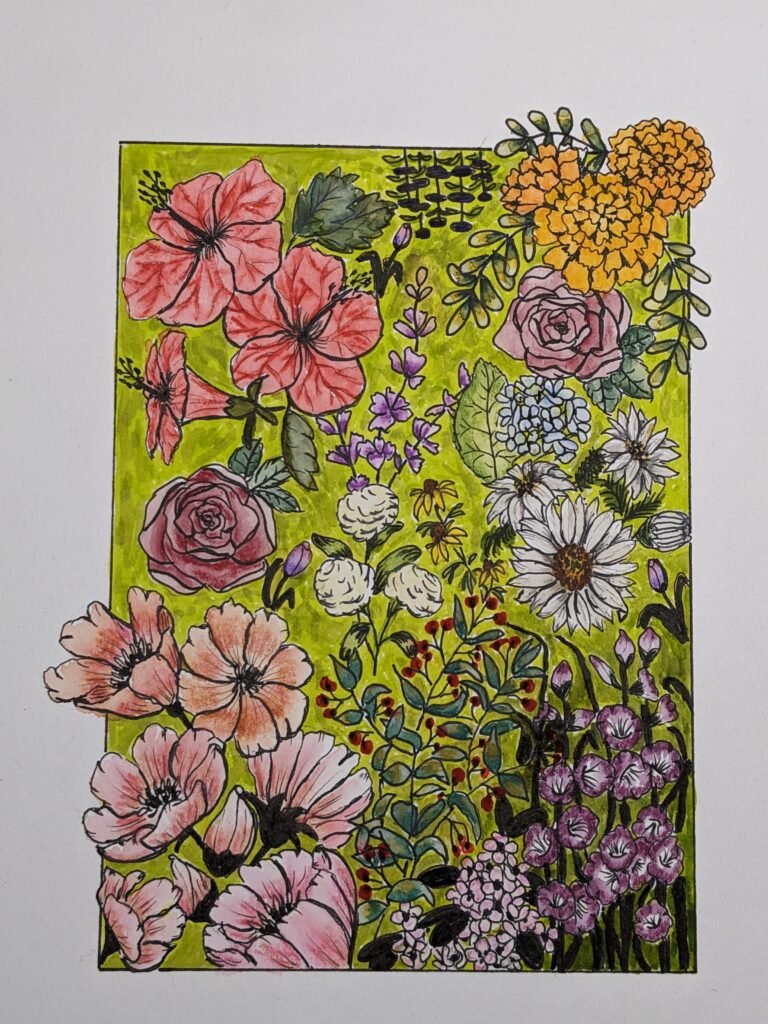
The grass collage had multiple larger flowers, cosmos, hibiscus, marigolds. Like before I used my alcohol markers to color in the background, by this time a light green. Once done I immediately grabbed my colored pencils and started adding color to the elements. One key difference is I added more color, it wasn’t just a hint like I had done with the sky collage.
I loved how both came out at the time and hung the pair in my home. At first, I didn’t have any plan to create the sun collage, but over time I realized the pair needed its companion. I decided to make this collage my largest ever. Instead of the piece fitting within an 8×10 matte, it would fill the page, but I did keep my frame in the design.
The Sun Collage
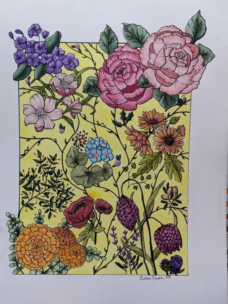
The sun collage had large, for me really large, peonies in the upper right corner. I added marigolds to the opposite corner. Once the lines were drawn, the background was a beautiful light yellow.
When I started to color the elements on this piece I chose to experiment with my new Tombow marker set in addition to my colored pencils. Nothing was left white, every flower and leaf was boldly colored. In the end I was surprised at the final piece, but happy with it.
The Conflict
Now my trilogy was complete and the sky, grass and sun were in matching frames hung above the sofa. They truly showed an evolution in my art, well at least to me they did. The odd part was as they hung there I would look at them and one day I loved the progression they represented, on another day they felt overdone, like I went too far with the color.
This conflict eventually gave birth to rule 5 of Beginner Art Supplies: 6 Rules Nobody Actually Tells You. It states “Any art supplies you purchase, use them before you buy anything else.” I was skipping around between several mediums, never focusing on learning one, trying to do everything at once. I bounced around like bunnies playing leapfrog in a field.
While these three collages meant a lot to me, over time I could look at them and understand why I had such conflict. Not learning more about colored pencils or Tombows, neither medium was used how they could have been. My zeal for using color in my art needed a filter, but evidentially my brain hadn’t found it yet. They were not only going to be the inspiration for the Botanic Series, but a foundation for the advice I give beginner artists.
Building the Botanic Series
Choosing the Flowers
Back to the Botanic Series, I looked at the sky, grass, and sun collages and chose the three flowers that were most represented in the set. The cosmos flower was large and in charge of the sky, while also being a cluster to anchor the lower left corner of the grass. The marigold flower was part of both the grass and sun collages. Lastly the peony, which had been so big and bold in the sun collage.
Just like the first time, I started with the cosmos. This was no small task considering the vastness of the cosmos. (sorry, I simply could not resist the pun) This would become Whispering Field. The next to be drawn was the peonies. I loved that they demanded to be seen. This one became Silent Sanctuary. The last one to be completed was the marigold, which became Murmuring Thicket.
Unlike their inspiration, no color was added to the flowers and leaves. Every element was filled with either white or black, keeping the palette completely clean before adding a background. When I began adding them, well, this is where I may have gone overboard.
The Digital Color Experiment
Working digitally gave me the freedom to experiment with any and all colors. I could not ruin a piece by choosing wrong. I promise you, I spent hours just changing the background color, playing with the color wheel in Clip Studio Paint (CSP).
Every color and hue you can imagine was tried; reds, blues, yellows, oranges, purples, and of course my favorite color green. I tried shades of grey, muted and bold colors, light pastels and rich deep tones. I looked at hundreds of colors. For me this was revolutionary, I can’t do this in my mind like most people and I admit I felt a twinge of jealousy and loss with that realization. But I had a blast doing it!
The Colorways
After all that experimentation, the Botanic Series eventually got the four colorways that are in the shop.
- Almost Aqua
- Kiwi Colada
- Linen Sage
- Raindrops on Roses
Three of these colors came from the Pantone 2026 color palettes. Linen Sage was a happy accident discovered in my aforementioned playtime in CSP.
The Names Behind the Pieces
If you are wondering how these pieces got their names, a little help from AI. I described the feeling these pieces invoked for me. They were quieter versions of their respective inspirations. Knowing this, I imagine the words whispering, silent, and murmuring make more sense now.
The Botanic Series gave me the opportunity to bring my traditional art, done with pen on bristol paper, and pull it forward into my now digital art world. Normally we can’t go back in time and correct past mistakes, but by making the transition from traditional to digital I was afforded the rare opportunity.
My original sky, grass, and sun collages that had progressively become overdone with color can now have a life that is cleaner and simpler. I was able to use these, well, boo-boos not mistakes, to embrace line art in a way I had not done since those first collages I spoke about.
Will I ever play around with coloring the flowers, leaves, and stems? I have actually already answered this in the form of Lily Behind the Veil and Magnolia Behind the Veil. Who knows where my art will go now.
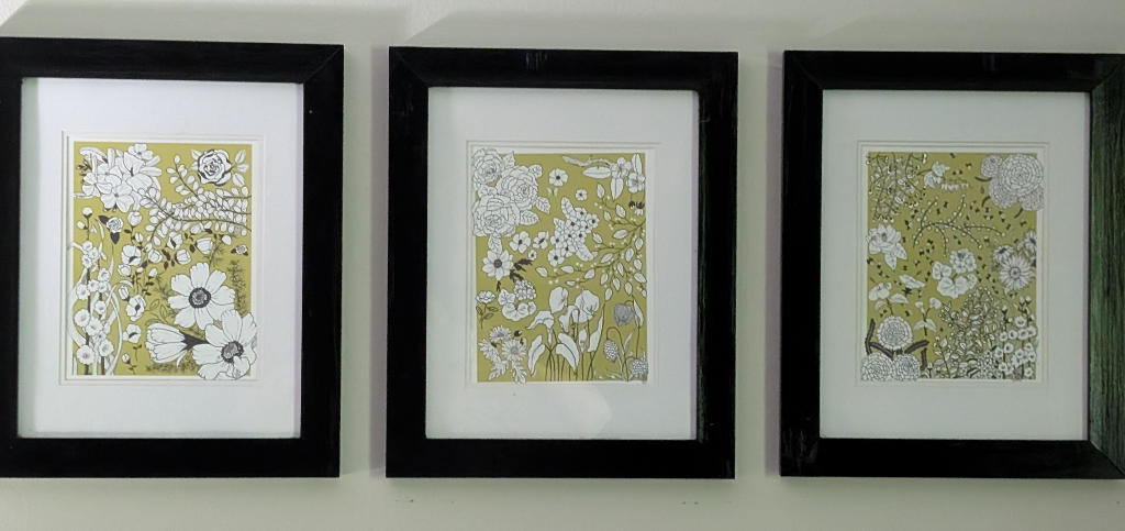
Today the sky, grass, and sun collages no longer hang above my sofa. They were replaced with 8×10 versions of the Botanic Series that I printed out on my ink-jet printer in my favorite colorway – Kiwi Colada.
